In the earlier days of my product design career, there was a recurring roadblock that I would come across that regularly made me feel quite upset or disappointed with my design, especially when it finally went into development. This roadblock, to put it shortly was that all my interface designs systems were far too visibly compressed (heights and distances) and elements looked too close together, which led to many other consequent issues in design, for instance, a lack of visual flow, underwhelming aesthetic and so on.
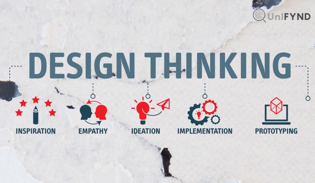
In a situation like this, any person could easily and in a very straight forward manner suggest to me a simple solution here: give more space to the elements in my interface design and voila! my problems will be solved. This is a fair suggestion and can seem like foolproof feedback at first, however it will only work out fantastically for a designer with EMPATHY, not just because this designer is taking the feedback for face value. Only if this designer has attempted to truly empathise with the USERs and consider why the solution is truly holistic for the USERs will the design and all following designs of that designer.
When it came to me and sympathising with users in the earlier phase of my product design career, I was not the best sympathiser. All my designs were driven by my compulsions as to what worked best in my opinion, not from what the data about users across the world had to tell me. If we go back to the example I mentioned, the problem of a far too condensed interface design rooted from my lack of wanting to sympathise with the fact that there is a certain minimum and maximum distance that UI elements need in order to have sufficient breathing room while being proximally placed enough to look related.
(https://builttoadapt.io/intro-to-the-8-point-grid-system-d2573cde8632 refer to this article to read about a fantastic UI spacing system; “The 8pt grid”)
I was trying to rely on my purely “Visual eye” along with minor comparisons with other platforms without building out a reliable system that can be used in order to create readable UI no matter what setting. This was a classic example of lacking sympathy affecting interface readability. This lack of empathy can have far reaching effects beyond simply the visuals, the effects of this can also reach into the development process and affect the speed and reliability with even which a developer can fulfill your designs in a thorough and scalable manner, considering how in this specific example, spacings and sizing are subject to change with varying screen sizes; we all know there is no possible way to police the dimensions of a design manually across the range of screen sizes out there.
All in all empathy, like in any other field out there leads to a sense for CONSEQUENCE. In a nascent field like product design, understanding consequences from multiple different angles makes the designer more empathetic and hence more feasible, desirable and viable as a designer and hence her designs as well.